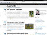
It has been a long time since the last layout update of this site. Originally I planned updating the layout around July last year when I was experimenting with web typography for the first time. I tried several different themes with custom fonts and even almost finished a own layout based on bootstrap and some free fonts from the Google web fonts. I wasn't totally convinced of my new layout so I decided it to postpone after my trip to Costa Rica, but as usual I never reactivated the project again.
A few weeks ago, I read the #webtypobuch by Gerrit van Aaken which reignited my flame for typography and again I started to try different web fonts and changes to my layout. Yesterday I read an article about web typography from hukl which finally convinced my to get it done.
So here it is! I adapted the Twenty Eleven theme from WordPress which I like for its simplicity and did several tweaks to adapt it to my needs. I removed several of my self-written plugins for recent comments, recent posts and similiar posts to keep it clean. Although it requires a monthly fee I decided to give fonts.com a try for the webfonts. Right now, I'm using Neue Helvetica for the plain text in a 45 Light version and 65 Medium/46 Light Italic for bold/italic text. The headings are written in Avenir in 65 Heavy and 85 Heavy for bold. For quotes I use PMN Caecilia as an serif font in the 45 Light/46 Light Italic version. For monospaced text I use the Helvetica Monospaced Roman.
I tested the layout on OS X and Windows running the major browser (Chrome, Safari, Firefox, Internet Explorer) and all seem to work quite well. As the layout is responsive it also looks great on iPhone or iPad.
Edit: I disabled the webfonts in mid of June 2013, as I think that the monthly fees are still too high.
